双语:这幅世界地图 比你以往见的任何一幅都精准!
Science Alert2016-11-07 15:52

We all know most maps of the world aren't entirely accurate. For starters, Africa is way bigger than it looks, and Greenland isn't nearly so vast.
我们都知道多数世界地图并不完全准确。首先,非洲比看上去要大的多,而格陵兰岛根本就没有那么大。
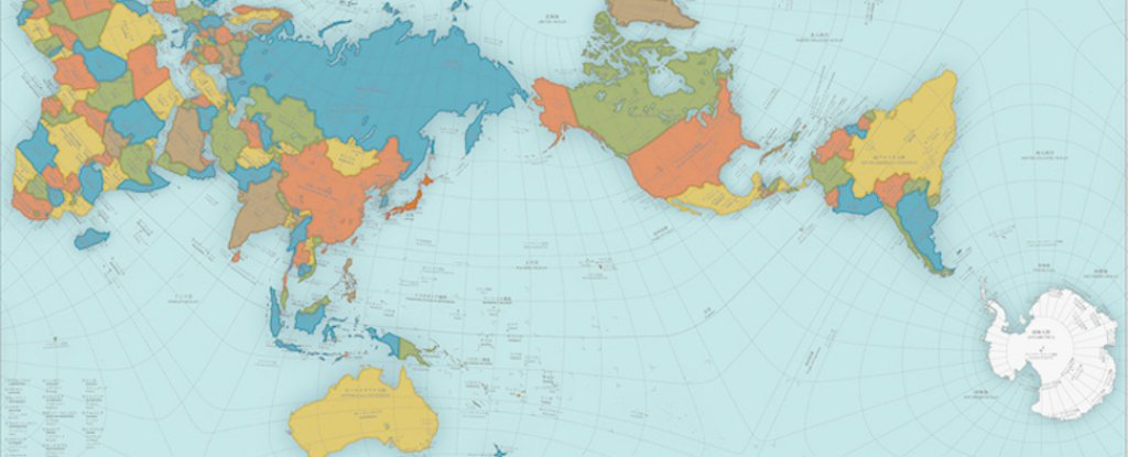
But now a designer in Japan has created a map that's so accurate it's almost as good as a globe, and it's probably one of the best estimations you'll see of the real size of countries.
但如今一位日本设计师设计了一幅非常精确的地图,几乎就像地球仪那样精确。在这幅地图上,你会看到各个国家的实际大小,而它很可能是最佳尺寸估算之一了。
The design, called AuthaGraph, is so good, it's just taken out Japan's biggest design accolade, the Good Design Award.
被称为AuthaGraph的这幅地图非常不错,而且它刚刚摘得日本设计届最高荣誉——优秀设计奖。
Created by artist and architect Hajime Narukawa, the map looks pretty weird at first glance, with an orientation shift between Asia and North America, but it's actually one of the most proportional maps we've got.
这幅地图是由艺术家兼建筑师鸣川肇设计的。乍看之下,这幅地图十分诡异,因为亚洲和北美洲的方位变了,但实际上这是我们能够拿到的最有比例性的地图之一了。
That's because creating a precise a flat map of our spherical planet is incredibly hard.
因为设计一幅精确的星球平面地图非常困难。
The map you're used to seeing pinned on classroom walls and in Atlases is known as a Mercator projection, and was first presented by the Flemish geographer Gerardus Mercator back in 1569.
过去常被钉在教室墙上而且常出现在地图册中的那幅地图以墨卡托投影著称,最早是由弗兰德地理学家杰拉杜斯·麦卡托提出来的,可追溯至1569年。
This technique works to more or less fit the countries of the globe on a two-dimensional piece of paper, and is great for ocean navigation. But it comes at the expense of accuracy - the Mercator projection makes countries close to the pole look much bigger than they really are.
这项技术基本上把地球上的各个国家安置在一张二维的纸上,而且它非常适用于远洋导航。但它是以精确度为代价的,因为墨卡托投影使那些靠近极点的国家看上去比真实尺寸要大的多。
For example, Greenland looks roughly the same size as Africa on most maps, even though the African continent has 14 times more land mass.
例如,虽然非洲大陆有格陵兰岛14倍多那么大,但在多数地图上,格陵兰岛看上去跟非洲差不多大。

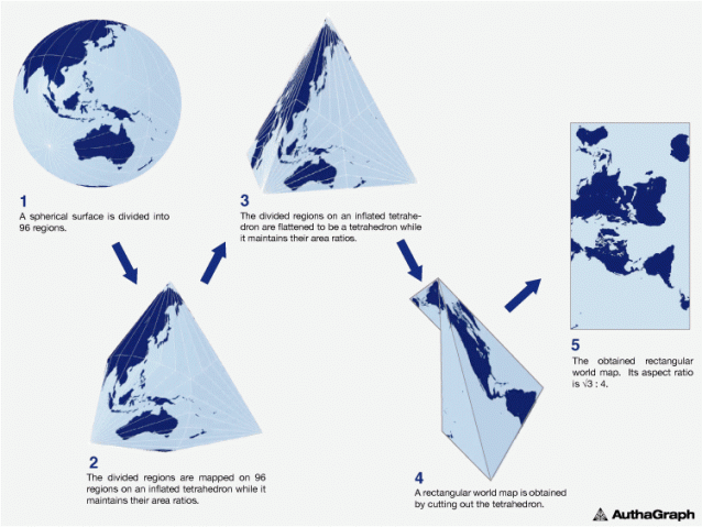
But the new AuthaGraph design aimed to fix that, by dividing the globe up into 96 equal regions, and then transferring those dimensions from a sphere to a tetrahedron, before generating the final map.
然而,新版的AuthaGraph地图旨在校正这个问题。它将地球分割成96块均等区域,然后在生成最终版地图之前把这些区域按比例从球体转移到四面体上。
By taking a few steps to get from a rounded sphere to a flat map, Narukawa managed to maintain the correct area ratios of land and water.
明川用了几个步骤把一个圆球变成了一幅平面地图,并设法维持正确的水陆面积比。
This new map isn't perfect - and seeing as north isn't necessarily at the top, it might not be the best for navigation. But it's pretty close.
这幅新地图并不是毫无瑕疵的,因为它的北部不一定在顶部,因此用来导航它可能不是最好的。
"The map [needs] a further step to increase a number of subdivision for improving its accuracy to be officially called an area-equal map," the Good Design Award description reads.
优秀设计奖简介上指出,“这幅地图需进一步加强细分来提高精确度,使其正式成为一幅面积均等的地图。”
(编辑:何莹莹)
相关推荐


